
Top 10 Data Visualization Tools
Hey there! You’re probably here because you’re swamped with tons of data and making sense of it all feels like finding a needle in a haystack. Don’t worry; we’ve all been there. That’s exactly why we’re talking about the “Top 10 Data Visualization Tools” today.
Best Overall

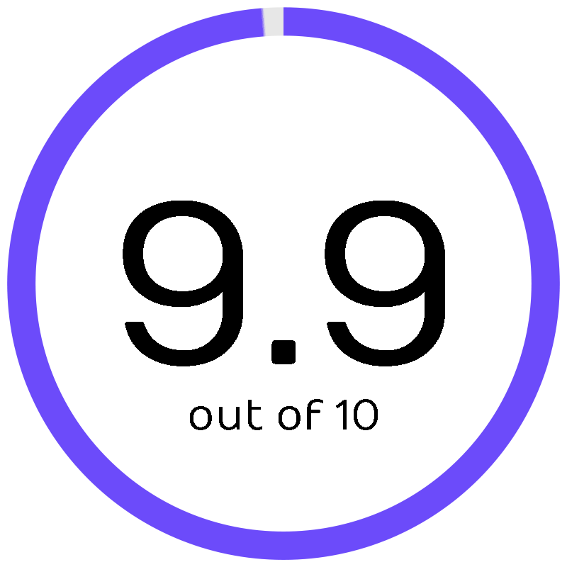
Tableau
Transform data into actionable insights with interactive, visual analytics.
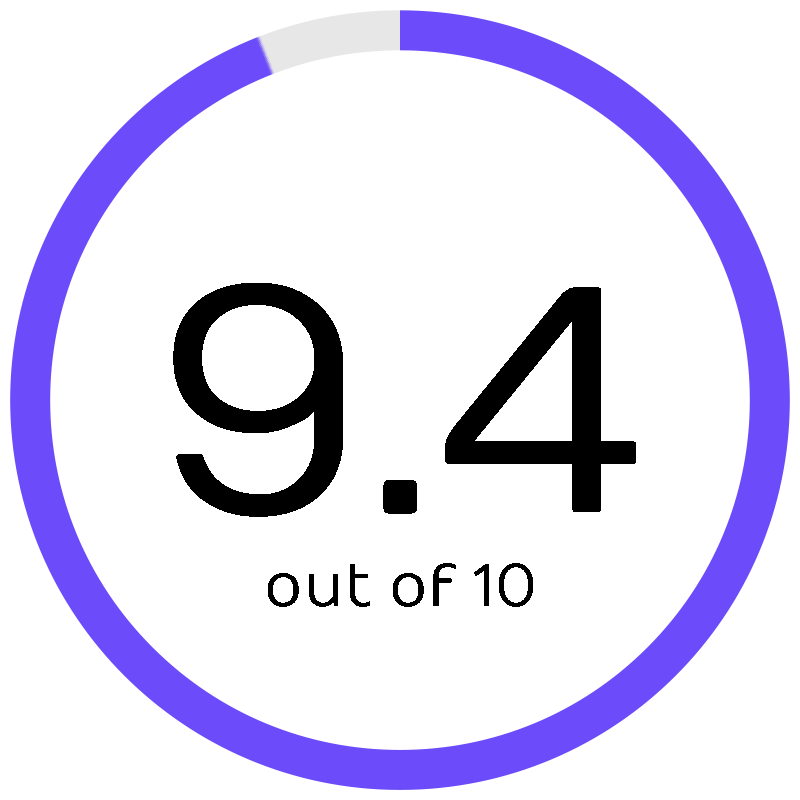
Best for Advanced Analytics

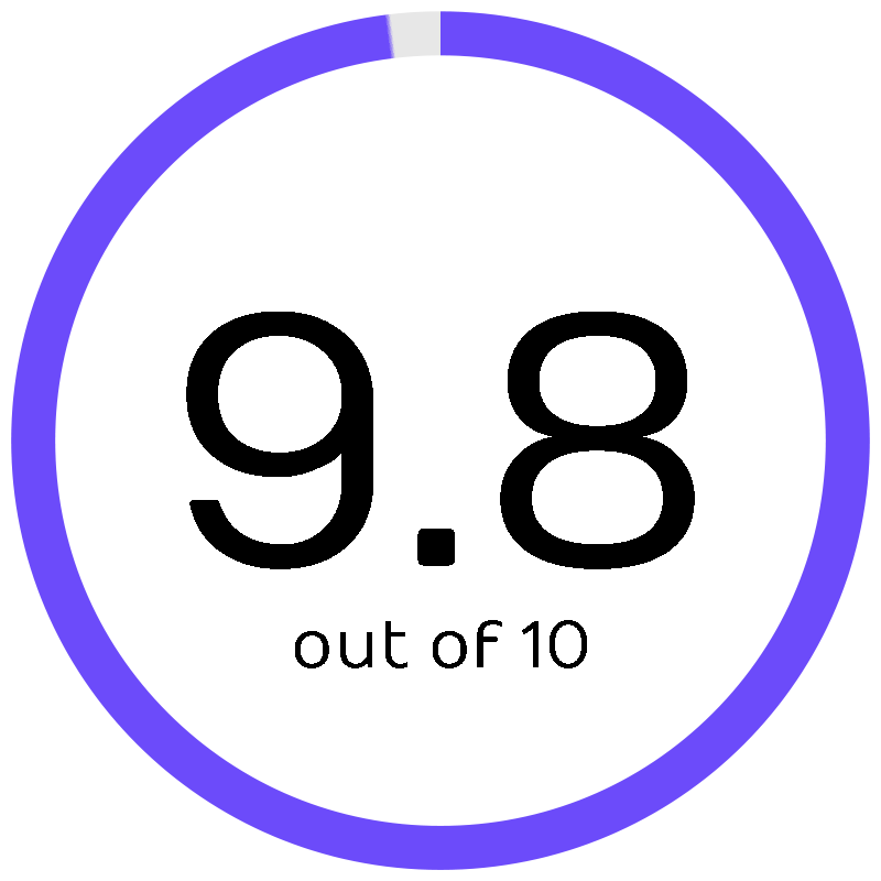
Jupyter
Open-source software for interactive computing across all programming languages.
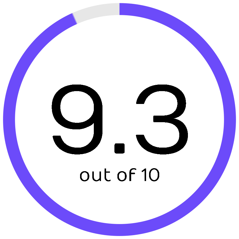
Most Cost-Effective

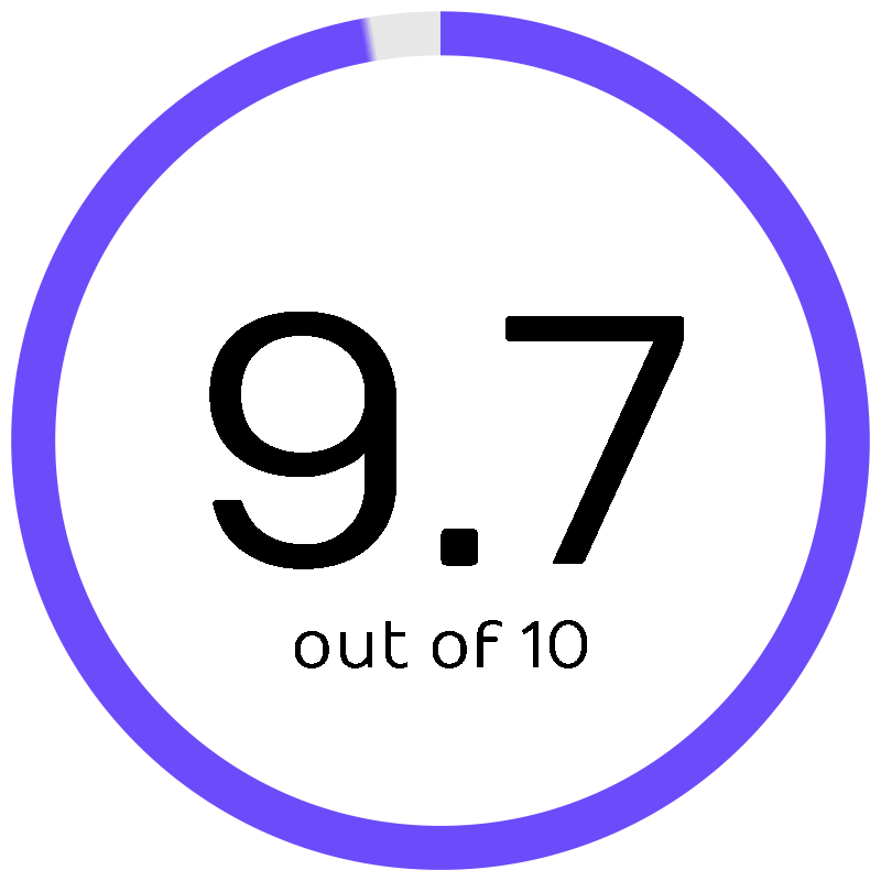
Datawrapper
Easily create charts, maps, and tables to visualize data without coding.
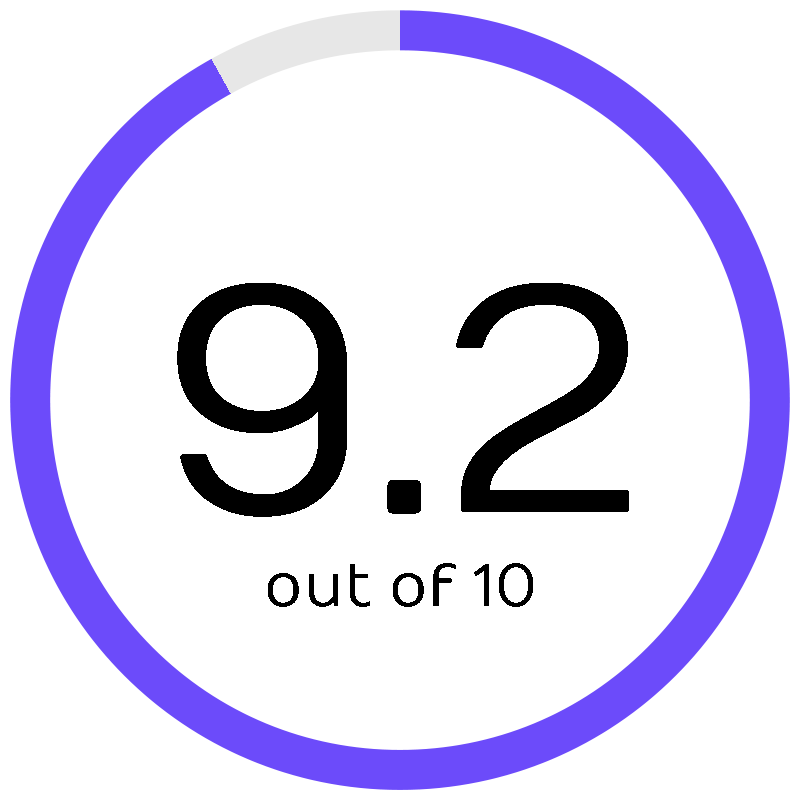
Most User-Friendly

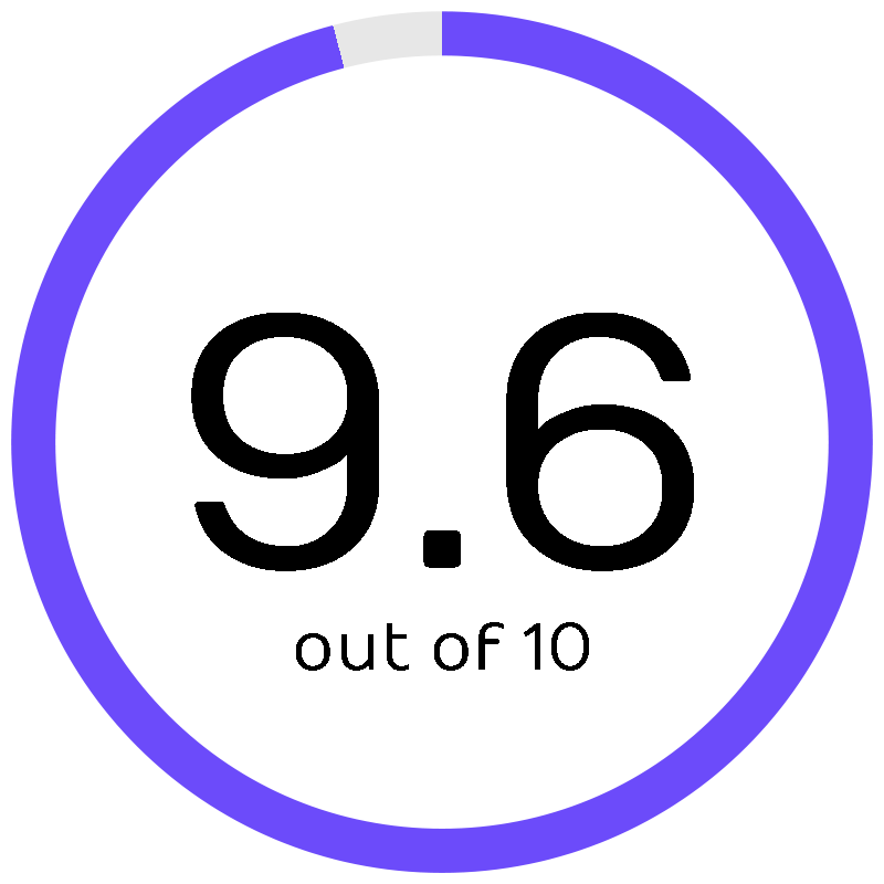
Canva
Simplify design with easy-to-use tools and a vast library of templates.
These tools are game-changers for turning complex data into clear, insightful visuals that anyone can understand. Whether it’s crunching numbers for financial forecasts or sifting through market research, we’ve got the perfect tool for your business needs lined up.
So, let’s get straight to the point and jump into our comprehensive guide. Up next, we’re diving into each tool, one by one, to help you find the best fit. Ready? Let’s get started!
What Are the Top 10 Data Visualization Tools?
Here are the Top Ten Data Visualization Tools that will help you turn complicated data into useful pictures. These tools have easy-to-use interfaces, powerful features, and beautiful design choices that will help you get your data across clearly.
1. Zoho

Softlist Take
You’ll find Zoho incredibly versatile for managing and visualizing data across various business functions. Its integration capabilities allow you to streamline workflows seamlessly.
Best
Overall
Price
Contact Zoho for pricing.
Discount
N/A
Promotion
Has free trial
Zoho offers a comprehensive suite of online productivity tools and SaaS applications, including powerful data visualization capabilities. It excels in integrating data from multiple sources into cohesive and actionable insights, enhancing decision-making for businesses.
Key Features
- Comprehensive suite of business applications
- Integrated data visualization and analysis tools
- Collaboration and automation features
Pricing
- Contact Zoho for pricing.
2. ClickUp

Softlist Take
ClickUp is not just a project management tool; it also offers features for visually tracking tasks and projects. Dive into the ‘Dashboards’ feature where you can create custom views of your projects using various widgets to monitor progress, workloads, and more, ensuring that every detail is right at your fingertips.
Best
Advanced Analytics
Price
Unlimited starts at $10/per member/month
Discount
Save up to 37% for annual plans
Promotion
Has Free Plan
ClickUp is more than a task management tool; it’s a productivity platform that combines project management with feature-rich data visualization capabilities. With its customizable dashboards and the ability to integrate with numerous apps, ClickUp facilitates a unified workspace that can significantly improve project oversight and team collaboration.
Key Features
- Interactive computing across various programming languages
- Integration of live code, visualizations, and narrative text
- Support for data visualization libraries
Pricing
- Interested users can make a donation.
3. Datawrapper
Softlist Take
Known for its simplicity and effectiveness without the need for coding skills, Data Wrapper offers a straightforward pricing model that can be very appealing for smaller teams or individuals looking for quality visualizations on a budget.
Best
Cost-Effective
Price
Custom starts at $599/month
Discount
N/A
Promotion
Has Free Plan
Datawrapper shines with its simplicity and focus on making data visualization accessible to everyone. Without the need for programming skills, users can create engaging charts, maps, and tables, making it a favorite among journalists, educators, and NGOs for storytelling with data.
Key Features
- No coding required for creating charts, maps, and tables
- Responsive design for visuals
- Wide range of chart types and customization options
Pricing
- Free- $0
- Custom- Starts at $599/month
- Enterprise- Contact Sales
4. Canva
Softlist Take
Its drag-and-drop interface and extensive template library make it incredibly user-friendly, not just for data visualization but for all types of graphic design work.
It’s particularly suited for users without a background in data analysis or graphic design. It simplifies design for you, offering a vast template library for any visual content need. Utilize its drag-and-drop feature for effortless creation.
Best
User-Friendly
Price
Canva Pro starts at $14.99/month
Discount
N/A
Promotion
Has free plan
Canva democratizes design with its user-friendly graphic design tool, which includes features for creating data visualizations. Its vast array of templates and design elements enables users with any level of experience to produce professional-looking visual content quickly, perfect for social media, presentations, and marketing materials.
Key Features
- User-friendly design tool with drag-and-drop feature
- Extensive template library for various designs
- Customizable charts and graphs for data visualization
Pricing
- Canva Free: $0
- Canva Pro: $14.99/month
- Canva for Teams: $29.99/month total for the first 5 people
5. Tableau
Softlist Take
Widely recognized for its powerful analytics, interactive data visualization capabilities, and broad integration options, Tableau often ranks highly for professionals and organizations looking for comprehensive data analysis tools.
You’ll appreciate how Tableau transforms complex data into digestible visual stories. Dive into its drag-and-drop functionality to uncover insights quickly.
Price
Tableau Viewer starts at $15/user/month/billed annually
Discount
N/A
Promotion
Has free trial
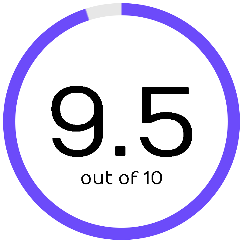
Tableau stands out as a powerful data visualization tool, offering deep analytical capabilities with ease. Its intuitive drag-and-drop interface allows for the quick creation of interactive and shareable dashboards, catering to both beginners and advanced users seeking to derive actionable insights from their data.
Key Features
- Intuitive drag-and-drop interface
- Powerful analytical tools for deep data exploration
- Interactive dashboards and visualizations
Pricing
- Tableau Viewer- $15/user/month/billed annually
- Tableau Explorer- $42/user/month/billed annually
- Tableau Creator- $75/user/month/billed annually
- Tableau Enterprise- Contact Sales
6. Klipfolio

Softlist Take
Klipfolio empowers you to make data-driven decisions by providing real-time dashboards. Its customizable options ensure that you can tailor your analytics to your needs.
Price
Standard starts at $250/month
Discount
N/A
Promotion
Has free trial
Klipfolio is a cloud-based data analytics platform that provides customizable dashboards for tracking business metrics in real-time. Its strengths lie in its flexibility and the ability to connect with a wide array of data sources, making complex data understandable at a glance.
Key Features
- Real-time data dashboards
- Wide range of data source integrations
- Customizable dashboard and reporting options
Pricing
- Free: $0
- Standard: $300/month
- Custom: Annual plan starts at $800/month
7. Highcharts

Softlist Take
Highcharts simplifies the process of integrating interactive charts into web projects. Its intuitive interface and comprehensive documentation make it accessible for developers of all skill levels.
With a wide range of chart types, including line, bar, column, and pie charts, Highcharts supports detailed and complex data storytelling. It also offers robust customization options, allowing users to tailor the appearance and functionality of their charts to suit their needs.
Price
Internal starts at $168/pe seat/ annually
Discount
N/A
Promotion
Has free trial
Highcharts is a JavaScript library for creating interactive, web-based charts. It’s praised for its wide compatibility and extensive customization options, allowing developers to craft precise and accessible data visualizations for any web project.
Key Features
- Interactive charting library for web applications
- Wide variety of chart types
- Extensive customization and accessibility options
Pricing
- Internal: $168/per seat annually
- SaaS: $332/per seat annually
- SaaS+: $827/per seat annually
8. Infogram

Softlist Take
Infogram is a leading platform renowned for its user-friendly design interface, specifically tailored for creating captivating infographics and detailed reports.
Boasting a vast library of templates, Infogram empowers users to commence their projects effortlessly, ensuring a seamless and efficient workflow.
Whether you’re a seasoned professional or just starting, Infogram provides the tools you need to craft visually stunning and informative visual content.
Price
Pro starts at $25/month
Discount
Save up tp 24% for annual plans
Promotion
Has free plan
Infogram is a web tool designed for creating visually appealing infographics, reports, and maps. It stands out for its ease of use and the ability to quickly turn data sets into engaging stories, suitable for presentations and social media sharing.
Key Features
- Easy-to-use infographic and chart maker
- Wide selection of templates and design elements
- Interactive visuals and embeddable reports
Pricing
- Basic: Free
- Pro: $25/month
- Business: $79/month
- Team: $179/month
- Enterprise: Contact Sales
9. BrightGauge

Softlist Take
Imagine easily compiling data from various sources into customizable dashboards and reports, enhancing your ability to make data-driven decisions swiftly.
A specific feature to explore is its goal-setting capabilities, which allow you to track progress towards key objectives directly within your reports.
Price
Standard starts at $316/month
Discount
Save 10% for annual plans
Promotion
N/A
BrightGauge simplifies data management for MSPs by aggregating data across multiple platforms into a single, customizable dashboard. Its real-time reporting and goal-setting features not only streamline operations but also enhance transparency with clients, making it an essential tool for managing and communicating key performance indicators.
Key Features
- Data aggregation from multiple sources into unified dashboards
- Customizable real-time reports and gauges
- Goal setting and tracking for teams and individuals
Pricing
- Standard: $316/month
- Enterprise: $436/month
- Enterprise+: $616/month
10. Jupyter
Softlist Take
Ideal for data science and analytics, Jupyter Notebooks support interactive data science and scientific computing across all programming languages. It’s particularly favored for its capacity to combine live code, equations, visualizations, and narrative text.
With Jupyter, your code comes to life. Its interactive notebooks are perfect for mixing code, visuals, and narrative in one place.
Price
Interested users can make a donation.
Discount
N/A
Promotion
N/A
Jupyter is ideal for those who work in data science, offering an open-source platform for interactive computing. It allows for the integration of live code, equations, visualizations, and narrative text, making it a go-to for collaborative projects and exploratory data analysis.
Key Features
- Interactive computing across various programming languages
- Integration of live code, visualizations, and narrative text
- Support for data visualization libraries
Pricing
- Interested users can make a donation.
Conclusion
Businesses that want to analyze and show their data quickly need to make sure they choose the right data visualization tool. Our review of the Top Ten Data Visualization Tools shows that there are a lot of options that can be used for different business needs, such as handling complex data analytics or making reports easier to read.
This guide is meant to help you choose a tool that makes it easier to understand data and gives you more power to make decisions, so your business can get the most out of data. Each tool has its own strengths, so this is where you start to tell better stories with data.
If you’re eager to dive deeper into the world of data visualization tools, we invite you to explore our extensive collection of insightful blog posts.
People Also Ask
What are data visualization tools?
Data visualization tools are software applications designed to represent complex data sets through graphical diagrams, charts, maps, and dashboards, making it easier to see patterns, trends, and outliers within large volumes of information.
Why are data visualization tools important for businesses?
For businesses, data visualization tools are crucial because they convert data into actionable insights, enabling decision-makers to grasp difficult concepts, identify new patterns, and effectively communicate findings to stakeholders.
Can data visualization tools handle real-time data?
Many data visualization tools are equipped to handle real-time data, allowing users to monitor business processes and market changes as they happen, enabling timely decisions based on the latest information.
Are there free data visualization tools available?
Yes, there are free data visualization tools available that offer a range of functionalities, from basic chart creation to more advanced analytics, suitable for businesses or individuals looking to visualize their data without a significant investment.
How do I choose the right data visualization tool for my business?
Choosing the right tool involves assessing your specific needs, such as the complexity of data you’re dealing with, the level of customization required, integration capabilities with your current systems, and your budget.